🔮 Unveil the Mysteries of Your Future!
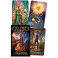
The Gilded Tarot Royale Deck features 78 beautifully illustrated cards with gold foil accents, accompanied by a comprehensive guidebook, making it perfect for both novice and experienced tarot readers. Crafted with high-quality materials, this deck is designed for durability and elegance, appealing to collectors and spiritual seekers alike.


M**N
Lovely, Vibrant, Borderless Deck
I do not have the "regular" Gilded Tarot deck but I am (visually) familiar with it through looking it up and seeing it used in videos. But this "Royale" deck is f'ing fabulous! It is so beautiful! It is vibrant, so much detail on each card. So many colors, you can just tell how much effort went into the creation of each card, they're just beautiful.They are borderless, unlike the regular Gilded Tarot Deck. These go all the way to the edge, and then they only have the little label at the bottom of each card with its name. No colored gem at the top like the other one. I prefer this, so I'm totally happy with it.Shuffles like a dream! Super glossy and yet easy to shuffle. No cards sticking together right after opening them. Just glide-y and smooth.My favorite things are that 1) they started "talking" to me right away. Flipping out the cards that represented me and my energy, and what I was talking about. 2) the black and white little booklet that comes with it for the meanings is a pleasant surprise. Many times I've been very unimpressed with what they choose to put in them because either they're a farce for the real meaning, or they're just like overtly negative on some cards. That is not the case with this little booklet! It's got plenty of concise info and the meanings are right on point for how I've always read Tarot. and then 3) as I mentioned before, the shuffling is fabulous with these, especially if you like pliable cards, and like to have "fliers" or "jumpers." I like for the cards to jump out, and this deck and its slight slipperiness (and glossiness) is great for that. And despite my shuffling, which is not aggressive but also not super gentle, I haven't had any damaged edges yet! I know with other decks (ahem, Valentine's Fairy Tarot) that even on first use or shuffle, cards can start to get messed edges and all that, and these don't have that problem. Wooh hooh! I love them, they speak to me, and I would totally recommend them to a friend. ;)
J**E
Excellent, beautiful deck!
Excellent deck by my favorite creator of tarot cards!Art work is outstanding and interesting. Color is vibrant, card stock is good.I've begun to collect decks designed by Ciro Marchetti as they are of such excellent quality and his symbolism speaks to me.
V**O
Beautiful
Such a beautiful deck, has a great energy, perfect for readings!
J**.
Beautiful quality deck
A beautiful deck. The little white book is very brief, but the deck is stunning. The art really hits a cord.
Z**Y
Awesome beautiful cards
Beautiful cards have the mini version on me near 24 7. I bought an extra set here which was a return and when I got it the cards had been resealed with the tower torn in half but i thought about unhexing and keeping but they are letting me return so I bought another new
F**N
Beautiful deck, great artwork
I first started learning about tarot cards using the standard Rider Waite Smith (RWS) deck that most people are familiar with. I bought several RWS decks (gold foil, vintage look, etc.) and slowly began learning the meanings of the cards. I saw a card reader online using this Gilded Tarot Royale deck and fell in love with the rich, colorful artwork. It's a bit of a challenge to "relearn" the card meanings with these different images, but there's a benefit to that as well. Instead of just spitting out memorized meanings, I'm able to interpret the cards more intuitively based on the gorgeous artwork. The card quality is decent - the cardboard is a decent thickness. They come in a basic cardboard box. Seeing "gilded" in the title, I was expecting there to be gold foil accents in the images or along the edges of the cards (there isn't) but overall I'm happy with this purchase.
K**H
Nice deck but....
I pre-ordered this deck and received it yesterday.Open the box carefully. It is an unusual configuration for a box, and if you don't notice that, you could rip it open easily. It's not at all a sturdy box. It's pretty thin and flimsy. I would have preferred the magnetic-closing box of the Gilded Reverie Lenormand deck (also by Marchetti) as I store my cards in their boxes, not in bags or fabric.The images on the cards are beautifully done. The cards are Rider-Waite-Smith based. They are very detailed and complex. The colors are rich and vibrant. That being said, however, the cards seem a little thinner and easier to bend than my Universal Waite Tarot.The edges are plain white. This surprised me as it is called the GILDED Tarot Royale Deck. It seems incongruous for such lush imagery to have such stark, plain edges.The companion booklet is concise and succinct and very usable, I think. It also includes reversal advice, which is nice.Overall impression is that it is not quite as nice in quality or impact as Marchetti's Gilded Reverie Lenormand Deck. Such beautiful images should have been produced in a more substantial presentation.
I**E
Tarot Cards
I have been interested in Tarot for as long as I can remember. I've had my cards read several times and each time they have been accurate. This deck is the Gilded Tarot Royale by Ciro Marchetti. I saw a reader on You Tube using this deck and was impressed by the look.The Gilded Tarot Royal is beautifully designed. The deck is packaged in a sturdy box and comes with a booklet that explains the card meanings. This is the standard deck which is a little larger than regular playing cards. I have small hands which makes card shuffling a little awkward; however, as I break the cards in, I think it will become easier to shuffle.The card stock is high quality and overall, I am pleased with my purchase and would definitely recommend them to Tarot card readers.
Trustpilot
2 weeks ago
1 month ago