The Japanese Cruiser Ōyodo (Super Drawings in 3D) [Sukhanevich, Alexandr] on desertcart.com. *FREE* shipping on qualifying offers. The Japanese Cruiser Ōyodo (Super Drawings in 3D) Review: Good but others are better. - This volume in the 3D series is good but not quite to the standards of other authors. Carlo Cestra, Mariusz Motyka, Waldemar Goralski do better work. That being said,I still had to have it. Love the Japanese Cruisers. Review: my paperback ran the gauntlet of the postal-system miraculously unscathed. Failure to do so, would have scythed the rating to One Star. The pictures and line-drawn plans are up to Kagero's normal high standards, although the text still needs an editor who can write good English. Kagero's version of the language tends to range between baffling to quaint; in Oyodo's case, it's at least comprehensible throughout. This extremely cut-priced, hybrid float-plane carrier is an interesting example of Japan's struggle to keep afloat, having awakened and enraged America's sleeping giant (pun not initially intended, but...what the hell!). Commissioned in February 1942, Oyoda was sunk in July 1945. She was, for a while, the cut-priced flagship of Japan's Combined Fleet. PS: In English, boats and ships don't have 'swimming ranges', although they may have in the author's mother tongue-- Polish?
| Best Sellers Rank | #1,942,611 in Books ( See Top 100 in Books ) #893 in Model Building #2,083 in Japanese History (Books) #3,001 in Naval Military History |
| Customer Reviews | 4.0 4.0 out of 5 stars (10) |
| Dimensions | 8 x 0.4 x 11.7 inches |
| ISBN-10 | 8366673650 |
| ISBN-13 | 978-8366673656 |
| Item Weight | 11.7 ounces |
| Language | English |
| Print length | 80 pages |
| Publication date | December 3, 2021 |
| Publisher | Kagero |
R**N
Good but others are better.
This volume in the 3D series is good but not quite to the standards of other authors. Carlo Cestra, Mariusz Motyka, Waldemar Goralski do better work. That being said,I still had to have it. Love the Japanese Cruisers.
E**D
my paperback ran the gauntlet of the postal-system miraculously unscathed. Failure to do so, would have scythed the rating to One Star. The pictures and line-drawn plans are up to Kagero's normal high standards, although the text still needs an editor who can write good English. Kagero's version of the language tends to range between baffling to quaint; in Oyodo's case, it's at least comprehensible throughout. This extremely cut-priced, hybrid float-plane carrier is an interesting example of Japan's struggle to keep afloat, having awakened and enraged America's sleeping giant (pun not initially intended, but...what the hell!). Commissioned in February 1942, Oyoda was sunk in July 1945. She was, for a while, the cut-priced flagship of Japan's Combined Fleet. PS: In English, boats and ships don't have 'swimming ranges', although they may have in the author's mother tongue-- Polish?
I**U
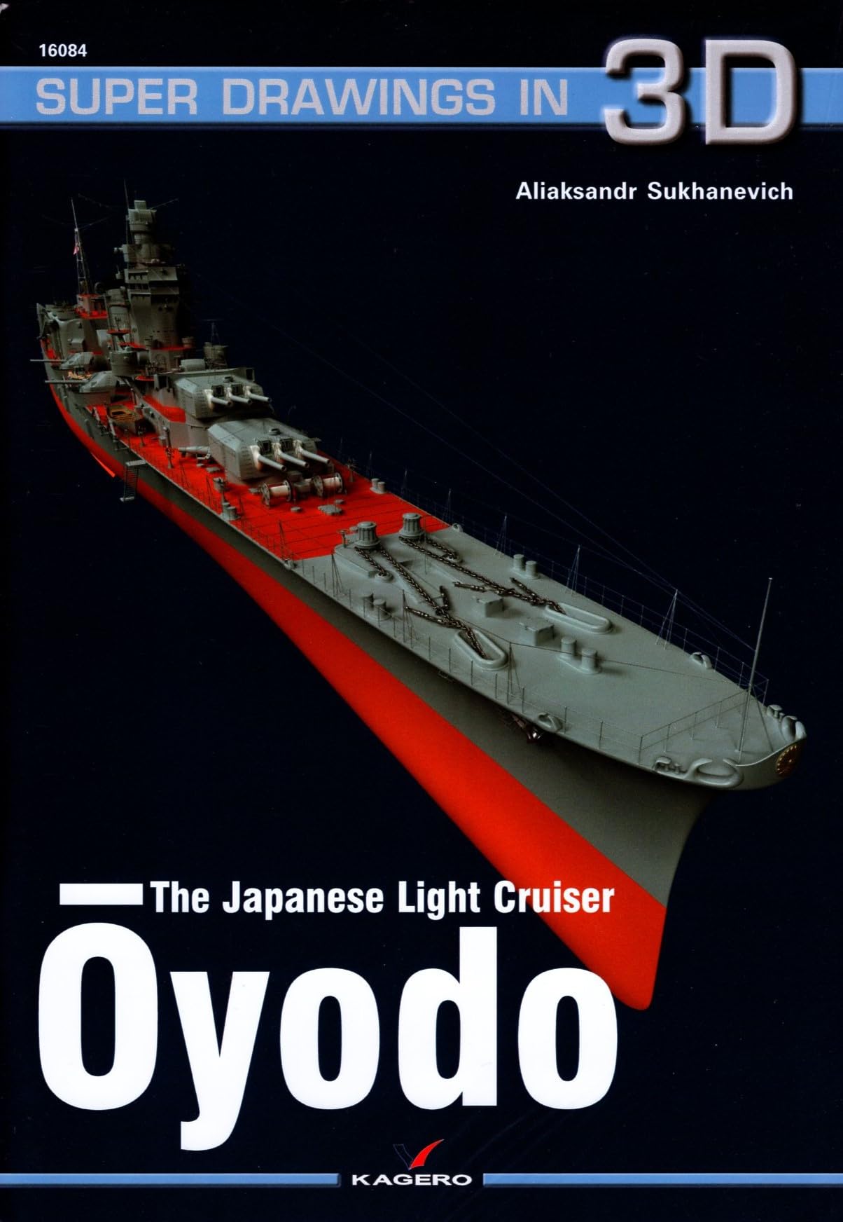
まず著者名ですがAliaksandr Sukhanevich氏のはずですがAmazonのサイトではAlexandrとなっています。何らかの時点でスペルミスが起こったものと思われます。 さて本自体のレビューですが、結論からいうと表題の通りということになります。前回同じ著者が浅間を描いたのに対しかなり厳しい評価をしたのですが、今回は随分よくなりました。 本とは別にA2版の用紙に艦の上面図と左右両舷の側面図が1/300、主砲塔、高角砲、カタパルト、零式水偵が1/100で描かれたものが付随しているのですがこれらの精密な図面に基づいて描かれた3DCGは大淀の全体像と細部をよく表しており一見の価値はあるという評価になります。 ただし、いくつか難点があることも事実で、以下4点それについて述べたいと思います。本書の購入を検討される方の参考になれば幸いです。 ①色彩面 サイトの表紙写真をみて同じ感想を持たれた方もおられると思いますが、全体的に色調が明るすぎると思います。 甲板のリノリウム…こんなに赤くなく茶色に近い色調のはず。 艦底色…もっと赤黒いはず。 軍艦色…私の目には白すぎるように見えます。 ②鉄甲板部の処理 ストリップとよばれる短冊状のすべり止め板が一面に溶接されているはずなのに、これが省略されて軍艦色で塗りつぶされています。このため非常にに平板に、俗な言い方をすればちゃちっぽく見えます。 ③艦橋上部の形状 添付の写真は艦全体の側面図のページを撮影し艦橋部を切り取ったものですが、ご覧の通り羅針艦橋と後方の測距儀支筒の間に大きな空間があるように見えます。なぜそのように見えるかという理由は2点あり、色々調べたのですがこれはやはり誤りであろうと結論づけました。この結論に至った主な根拠は雑誌「丸」2022年3月号に掲載されている大淀の公式図面です。 まず1点目、羅針艦橋上部の防空指揮所と支筒の間は床でつながっていることは正しく表現されているのですが、ブルワークが短く描かれブルワークの切れた後ろはハンドレールがあるように描かれており、さらにその床やハンドレールが非常に薄いので、一見ここに空間があるように見えてしまっています。 しかし「丸」誌106ページに掲載されている側面図を見ればブルワークは少し高さを減じながらも真横から見て支筒の側部にかかる程度に伸びていたことが見て取れます。 次に2点目ですが羅針艦橋の床面の表現が誤っています。添付の写真をみれば羅針艦橋後方側面の信号灯が艦橋の床面と同一平面にあるように見えますが、実際には艦橋床面は信号灯やその後方の手旗信号台のフラットより一段高いレベルにあり、それが支筒までつながっています。この一段が抜けているために艦橋の床面から天井すなわち防空指揮所の床面までの高さが実際より大きく見え、しかも前述のように防空指揮所の床面が薄くて見えづらいためにここに大きな空間があるように見えます。 なお、艦橋床面と信号灯の段差は著者自身が艦橋の細部を描いたページではきちんと表現しているのに、なぜこんなミスをしたのか理解に苦しみます。 さらに付け加えれば、羅針艦橋後壁すなわち測距儀支筒に接する形で海図台があるはずでこれも視覚的にはこの空間を埋める効果があったはずです。 このあたりの考証は「丸」誌46ページの「艦橋諸平面図」を参考にしました。 ④最後にCGではなく記述について 全体的にはよく大淀の様々な特徴を調べて記述しているのですが、一点だけ明確な誤りを発見しましたので指摘しておきます。それは「マル5計画で改大淀型5隻が建造され1945年には日本海軍の標準型軽巡となる予定であった。」と述べられていることです。もちろんこれは改阿賀野型と混同しているのですが、念のため本書4ページから当該部分の原文を引用しておきます。 As the design by Commander Fukuda did not fully satisfy the command (too small range),the fifth fleet replenishment program included the construction of five more cruisers numbered 810-814.In year 1945 they became the 'standard' light cruisers of the japanese fleet. この部分だけ読めば日本海軍にとって大淀型では不満足なので(日本海軍にとって正統派である)改阿賀野型が計画されたと読めなくもないのですが、その前に大淀の計画経緯の説明をしてきた末に上記の引用文が来ているので、著者のいうfive more cruisers は改大淀型を意味しているように思えます。 以上4点長々と批判めいたことを書きましたが、最初に述べた通り本書全体としてはそれなりに評価できるものと考えています。
Trustpilot
5 days ago
1 month ago