
DOWNLOAD THE APP


Customer Services
Copyright © 2025 Desertcart Holdings Limited
DOWNLOAD THE APP


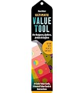
🎯 Nail your palette, own your brand.
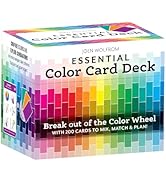
The Ultimate 3-in-1 Color Tool 3rd Edition is a comprehensive color resource featuring 24 numbered swatches, 5 color plans per shade, and 816 colors complete with CMYK, RGB, and HEX formulas. Designed for designers and creatives, it includes dual value finders for precise color harmony, making it an essential tool for professional-grade color accuracy and inspired creativity.


| Best Sellers Rank | #106,047 in Books ( See Top 100 in Books ) #984 in Hobbies & Games for Young Adults #1,357 in Design #1,366 in Puzzles & Games |
| Customer reviews | 4.7 4.7 out of 5 stars (1,392) |
| Dimensions | 10.16 x 1.14 x 23.65 cm |
| Edition | 3rd Revised ed. |
| ISBN-10 | 1607052350 |
| ISBN-13 | 978-1607052357 |
| Item weight | 1.05 Kilograms |
| Language | English |
| Print length | 1 pages |
| Publication date | 1 January 2011 |
| Publisher | C&T Publishing |
F**N
I love it.
I love it !
A**R
It contains everything you need for colour schemes.
K**L
Systematische Übersichten von Farben, Farben, Farben .... auf übersichtlichen Karten zusammengefasst. Die Möglichkeit das Kartenmaterial auseinanderzunehmen (es ist an einer Ecke mit einer Plastikschraube zusammengehalten) ist sehr sinnvoll für meine Zwecke. Das einzige Manko könnte sein, dass die einzelnen Farbfelder recht klein sind - dafür ist das Ganze aber auch sehr praktisch und passt in jedes Täschchen.
A**A
El libro presenta la teoría del color de una manera muy sencilla. Para cada color, muestra colores complementarios, triádicos, etc. Tiene 2 páginas de buscadores de valor, una verde y otra roja. Muestra el valor RGB, HEX y CMYK de cada color y tiene explicaciones sobre cómo usar el libro. Use el libro para encontrar los colores adecuados, para los libros de colorear para adultos. Me gusta mucho.
K**S
I used it to decide on colors for some packaging and needed just a bit of safety to compare it with my screen colors. Some colors you might have to imagine the result of a mix of two that you have on the fan (You wont be able to get all 3 colors mixed, it is always 2 plus Black, some extra pages with 25/50/75% mix of a third would be awesome for the next version!) , but for the price, that's fine and I found it plenty helpful. Its also very easy to hold two colors together unlike in the books that are more complex and the colors are somewhere in the middle of the page. You end up trying to get colors next to each other by bending pages, which of course isn't ideal.
R**S
Ben fatto e utile per comprendere la scienza del colore
Trustpilot
2 months ago
1 week ago